
Piano Keys, Colour, and The Intricacies of Feeling
Why a minor key was never just sad
Recently, someone left a comment on one of my Instagram posts asking how I developed my colour system and whether I had designed it to reflect emotions from the start.
It's a question I find genuinely interesting, because the answer is no. And yet the connection to emotion is real.
When I first built my colour system, I wasn't thinking about feelings at all. I was thinking about progression, about how one colour could lead into the next seamlessly. Red easing into orange, orange into yellow, yellow into green. Those transitions feel harmonious because they move by small steps, each colour sitting close to the one beside it, just as C, D, E, F, G, A, B move through a scale in a way that feels natural and almost inevitable. That was the whole logic: not emotional instinct, but proximity. Beauty built through gradual progression; harmony built from nearness — one tone, one colour, leaning into the next.
What I've come to understand more deeply since is that this logic was never merely decorative. Harmony, by its nature, is structure — it is how tones are organised and related to one another. And because I assign one colour to each tone, colour takes on that same structural role. A colour in my work isn't an embellishment laid over the music. It is the music's architecture made visible. That's the part I want to be clear about: colour here is doing the work of harmony, not indulging in prettiness. It's precisely because colour becomes structure that it can hold what structure holds, including the full intricacy of feeling.
The richness within a single key
Here's what I've discovered since coining my practice "Drawing Music," and since assigning each piano key (C, D, E, F, G, A, B) its own fixed colour. That colour doesn't change based on the emotional context of the piece. C is always C's colour. D is always D's colour, and so on.
This means something crucial happens when you translate a piece in a minor key visually. A composer choosing to write in A minor isn't choosing to erase the brightness of C, D, E, F, G, A, B. They're choosing to frame those same notes differently — to arrange them in a way that creates harmonic darkness, tension, shadow. But the colours remain. They're still there, still singing.
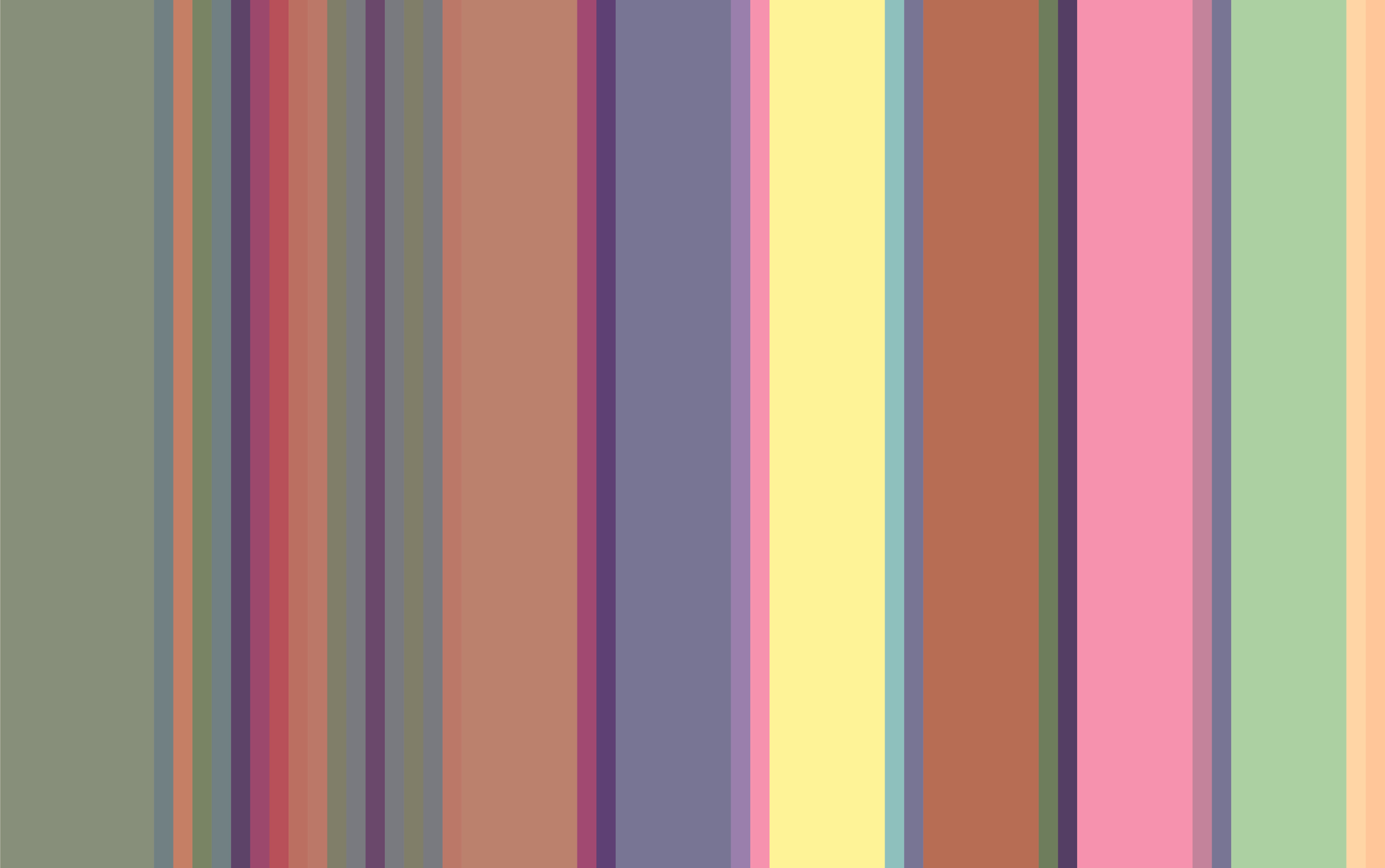
So when you look at a visual translation of a minor-key piece in my work, you don't see a dark, monochromatic result. You see colour, and often quite vivid colour! The minor tonality creates a particular emotional weight, a certain gravity or melancholy. But it doesn't darken the palette. Instead, you get moments of pure brightness held within that darker frame (see the image below). A flash of yellow or green or blue emerging from what might otherwise feel sombre.
This is, I think, the most honest visual translation of what minor keys actually feel like: not the absence of light, but light moving through shadow. Not one emotion, but several layered together. A piece can feel mournful and still be radiant. Sad, yes….but also bright. Multifaceted and multilayered.
This is why my system insists on colour even when the music becomes sombre. Because human emotion isn't a single tone - it's a chord.
A question of origin
The same commenter raised something else I've thought about before: could a different colour system be built for a Phrygian scale, or another mode? Absolutely. A different harmonic logic would generate a different colour progression, which would be equally coherent and equally beautiful in its own terms. The Phrygian mode has a distinctive character. Think mysterious, almost a Middle Eastern quality, which the Phrygian-based colour system might honour in its own way.
My system is not the only possible one. It is a system — built on one kind of harmonic logic. What matters is the internal coherence: that each step leads beautifully into the next, that the whole holds together the way a well-composed piece holds together. As an artist, I rely on insight and an internal pull toward the "right" progression.
Excerpt from Bach’s Prelude in E Flat Minor, Bars 25 - 27
What you're really drawn to
Recently, I created a colour archetypes quiz, which is not to tell you which colour you are, but to offer a language for noticing which harmonic qualities you're naturally drawn to.
I want to be careful here. The system I've built is, in the end, a system: one particular mapping of colour to tone. Another mapping could have been just as coherent. What matters isn't the colour itself, but the function i.e. the harmonic role that colour carries. The dominant has its own particular pull. The submediant its own gravity. These qualities are what the quiz is really asking about.
The colour you name as your favourite isn't always the one you reach for. The quiz is centred on that second one, on the tone you instinctively return to, not the one you'd declare (though sometimes they're the same).
I'm building a deck of cards around these qualities, and they'll be available to you free when they're complete.
Take the quiz and discover your colour archetype →
You'll get your result straight away. Sign up, and you'll receive a fuller description of your own archetype alongside the complete set — and be first to know when the deck of cards lands.